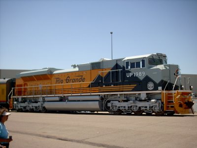
As you can see, the paint scheme is largely derived from the 40s and 50s era F-units with gray on top, just like the F-units and four stripes down the length, also from the cowl scheme. The only nod to the freight, black-with-gold design is the placement and size of the Rio Grande speed lettering down the side, which was what was used on the GP-30s and -35s purchased in the 50s. This was before the billboard style with the little "Rio," big "Grande" lettering.
The large mountains occupying the nose are taken from the Main Line Thru the Rockies logo. It's entirely appropriate to do this for a one-of-a-kind paint job as it emphasizes the territory traveled by the Rio Grande. However, it's pretty easy to suppose that the Rio Grande itself would have never gone to such lavish extremes for standard road units.
The impression from most of the people I talked to at the unveiling is that they were pleased with the design. No one commented that there was too much grey or that they should have done a coal black unit. One possibility for their not going with an orange and black unit would be their reluctance to look too much like their competitor that has begun to take on an orange and black swoosh logo, which isn't different enough from the speed lettering of the Grande.
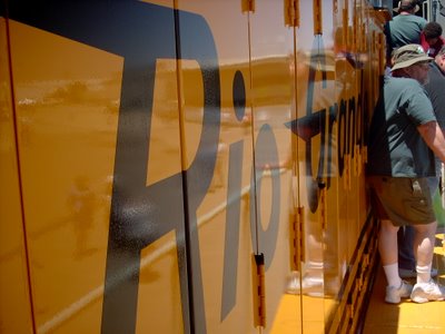
Here's a close-up of the Rio Grande lettering from on board the new SD-70ACe.

Kevin has posted better, much better shots at his ColoradoRailfan.com site. Go take a look.

No comments:
Post a Comment
Colorado Railroads is a site dedicated to preserving and presenting rail transportation in the Centennial State. Join the growing fascination with railroading and the lives and industries connected by a ribbon of steel across, over and through the Continental Divide!